Analytics Essentials: How to Read & Use Cohort Charts
In the data-driven world of marketing, understanding your customers is more important than ever. Enter cohort charts - a powerful visual tool that helps you slice and dice customer data to uncover actionable insights into how people interact with your brand over time.
For a digital marketer, understanding cohort charts is crucial because they offer invaluable insights into user behavior, enabling you to make data-driven decisions across crucial aspects of your marketing strategy.
What is a cohort chart?
In essence, a cohort chart is a graph that groups customers based on shared characteristics, typically their acquisition date (e.g., the month they signed up). It then tracks how these cohorts behave over time. This structure allows you to see trends and patterns that might be hidden in aggregate data. Here’s a small list of things that cohort charts help visualize:
Retention Rate: Percentage of a cohort that remains active over time.
Customer Lifetime Value (CLV): Projected revenue a customer will generate throughout their relationship with your business.
Conversion Rates: How well different cohorts move through your sales funnel.
Engagement Metrics: Website visits, content interactions, or other measures of user activity.
Why Marketers Love Cohort Charts
That list above should make it pretty clear why marketers love cohort charts and why anyone who wants to get involved in the marketing of their business should familiarize themselves with cohort analyses. They’re versatile visualization tools that help contextualize data. Here’s how the, when organized by cohort, the data above can provide insight into business marketing on multiple levels:
Understand customer journeys: By analyzing how different cohorts interact with your brand over time, you gain insights into their lifecycle stages and understand how their behavior evolves. This allows you to tailor your marketing efforts to each stage, catering to their specific needs and interests.
Segment your audience effectively: Cohort charts help you identify distinct user groups based on their acquisition date or other relevant characteristics. This allows you to segment your audience more effectively, creating targeted campaigns that resonate with each segment.
Evaluate marketing campaign effectiveness: You can use cohort charts to measure the impact of your marketing campaigns by analyzing user acquisition and engagement metrics before, during, and after the campaign launch. This allows you to see if the campaign reached the desired audience and had the intended effect.
Identify areas for improvement: By pinpointing which cohorts perform better or worse in specific metrics like retention or purchase rate, you can identify areas where your marketing efforts may need improvement. This helps you optimize campaigns and allocate resources more effectively.
Personalize the user experience: Cohort analysis helps you understand how user behavior changes over time. This allows you to personalize the user experience by delivering relevant content and recommendations based on their specific stage in the customer journey.
Now that we understand the value of cohort charts, let’s dive into HOW to read them to glean all those tasty marketing insights that we just talked about. Reading a cohort chart might seem complex at first, but with a little understanding, it becomes a powerful tool for analyzing user behavior. Here's how to navigate it:
Understanding the Structure of a Cohort Chart:
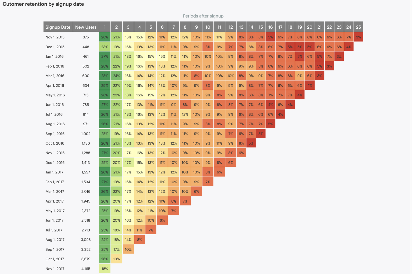
Every cohort chart should be looking at how different groups of people have behaved in the context of a single action (in relation to your business) over fixed periods of time. The periods of time are constant and customizable but most people look at days, weeks, or months. The behaviors analyzed are usually key actions that add value to your business (such as purchases or site visits).
Rows: Represent different cohorts, typically defined by acquisition date (e.g., users acquired in February 2023, March 2023, April 2023, etc.).
Reading left to right will help you track how each cohort performs. Look for trends like declining engagement, spikes in churn, or increased purchases later in the lifecycle.
Columns: Represent time periods after the cohort's acquisition (e.g., Month 1, Month 2, Month 3, etc.).
Reading vertically will tell you how different cohorts compare. Identify high-performing cohorts to understand their characteristics and replicate their success. Compare new cohorts to established ones to assess effectiveness of acquisition strategies.
Diagonals: Trace a diagonal down the chart to see how many users from a specific cohort remain active over time. This reveals drop-off points and areas for improvement.
Values: Indicate the percentage or number of users within a cohort performing the specific action pulled for that chart (e.g., active users, returning customers).
Other Nuances of Cohort Charts to Consider:
Color shading: Often used to visualize changes in values. A sharp change in color signifies a significant increase or decrease.
Focus on changes: Look for areas with the biggest difference in values between periods or cohorts. These are potential areas of investigation.
Context matters: Interpret data considering factors like overall trends, industry benchmarks, and specific marketing campaigns.
Cohort charts are a powerful weapon in the marketer's arsenal. By mastering their analysis, you'll gain deep insights into customer behavior, optimize your marketing strategies, and drive better results for your business.

